Orka Energy App
Project overview
The Product:
Orka Energy App is marketed towards home owners with smart meters to see there entire energy usage in one place. Orka Energy App strives to make it easier to see your usage in one place as well as making users take more concious efforts to be more ecofriendly in their energy usage.
Project Duration:
September 2021
My Role & Responsibilities:
Lead UX designer & UX researcher
- User research
- Wireframing
- Prototyping
- High Fidelity Mockups
The Problem:
Many home owners have mutliple accounts with different energy providers, Orka Energy consolidates energy usage totals into one simple app.
The Goal:
The goal is to make it easier to see your usage in one place as well as making users take more concious efforts to be more ecofriendly in their energy usage.
User Research: Summary
I conducted interviews and created empathy maps to understand the users I’m designing for and their needs. A primary user group identified through research are home owners with smart meters as well as multiple providers for utilities (Elecrtricity, Gas & water).
This user group confirmed initial assumptions about home owners, but research also revealed that home owners had a estimate of what there energy consumption was but didnt know how to be more eco-efficient. Other users problems included challenges that make it difficult to forward plan their energy consumption and ultimately bring down there monthly tariff costs.
User Research: Paint Points
-
Pain point:
Users want to view all of there utility bills in one place.
-
Accessibility:
People want to be able to find what they are looking for easily and quickly.
-
Information Architecture
Using a sequential style sitemap will aid in the ability to view necessary data easily and efficiently.
User Journey Map
Mapping Sylvias user journey revealed how helpful it would be for users to be able to filter by category or by tutor to find relevant tutorials as quickly as possible.


Digital wireframes
As the initial design phase continued, I made sure to base screen designs on feedback and findings from the user research.
Identifying a persons accessibility requirements was a key user need to address in the designs in addition to equipping the app to work with assistive technologies.

Low-Fidelity Prototype
Using the completed set of digital wireframes, I created a low-fidelity prototype. The primary user flow I connected was from the overview energy section through to the different filtering overviews for the user and their needs, so the prototype could be used in a usability study.
View the Low-Fidelity Prototype
Usability study: Findings
I conducted two rounds of usability studies. Findings from the first study helped guide the designs from wireframes to mockups. The second study used a high-fidelity prototype and revealed what aspects of the mockups needed refining.
Round 1 findings
- Users appreciate the clear layout
- Users like that they can see overviews of each energy type
- Users appreciate the information being used and then filtered on their needs
Round 2 findings
- Users wanted identifying information to see how they compare to high or low usage
- Users wanted a way to compare past usage
- Needs more icons for accessibility
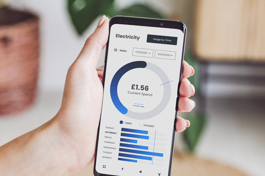
Mockups
- Added identifying information to see how they compare to high or low usage
- Added a way to compare past usage on the utilities pages
- Added icons in the navbar to switch between each energy category quickly
Please see before and after images below.

High-Fidelity Prototype
The final high-fidelity prototype presented cleaner user flows for navigating, filtering by utility and maximising visual focus on user centric data.
View the High-Fidelity Prototype


Accessibility considerations
- Provided clear pathways to user centric data.
- Used icons to help make navigation easier.
- Used detailed imagery for to help all users better understand the data.
Going Forward - Takeaways
Impact:
The app makes users feel like Orka Energy really thinks about how to meet their needs.
One quote from peer feedback:
“I can now easily see all of my utility costs in once place and in real time!"
What I learned:
While designing the Orka Energy app, I learned that the first ideas for the app are only the beginning of the process. Usability studies and peer feedback influenced each iteration of the app’s designs.
Next Steps
- Conduct another round of usability studies to validate whether the pain points users experienced have been effectively addressed.
- Conduct more user research to determine any new areas of need.
Thank you!
Thank you for your time reviewing my work on the Creative Supply! If you’d like to
see more or get in touch, my contact information is provided below.
Email: joshua@mcleandesign.co
Website: mcleandesign.co
Written by Joshua Mclean

Leave a comment
This site is protected by hCaptcha and the hCaptcha Privacy Policy and Terms of Service apply.