Article: Creative Supply

Creative Supply
Project overview
The Product:
Creative Supply is an online video tutorial platform to help creatives or like minded people find tutorials and learn what they want, when they want.
Project Duration:
September - October 2021
My Role & Responsibilities:
- Lead UX designer & UX researcher
- User research
- Wireframing
- Prototyping
- High Fidelity Mockups
The Problem:
To relieve the stress and anxiety for the needs of those want to quickly and easily have access to learning tutorials or programs.
The Goal:
The goal is to make it accessible to those who want to learn at their own pace.
User Research: Summary
I conducted interviews and created empathy maps to understand the users I’m designing for and their needs. A primary user group identified through research are mainly students who require additional materials for learning their core subject or just want to learn a new skill in their down time. This user group confirmed initial assumptions about other similar platforms, but research also revealed that the ability to deep filter and be granular in finding the correct tutorial was paramount.
User Research: Paint Points
-
Pain point:
People want to learn at there own pace.
-
Accessibility:
People want to be able to find what they are looking for easily and quickly
-
Information Architecture
A lack of clear filtering options for on other platforms makes the experience frustrating.

User Journey Map
Mapping Davids user journey revealed how helpful it would be for users to be able to filter by category or by tutor to find relevant tutorials as quickly as possible.

Sitemap
Difficulty with website navigation was a primary pain point for users, so I used that knowledge to create a sitemap.My goal here was to make strategic information architecture decisions that would improve overall website navigation. I chose the 'Matrix' structure to allow users to jump into any point of the website not matter where they are.

Digital wireframes
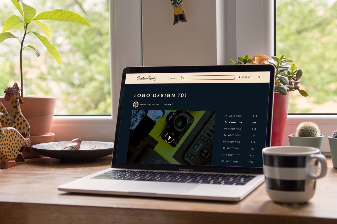
Taking the time to draft iterations of each screen digitally ensured that the elements that made it to digital wireframes would be well-suited to address user pain points. For the tutorial screen, I prioritized a quick and easy layout with a focus on the video with a background colour separation to help users enrich their experience.

As the initial design phase continued, I made sure to base screen designs on feedback and findings from the user research.

Creating a simple and clear layout with a focus on learning or watching as quickly as possible was the key.

Low-Fidelity Prototype
Using the completed set of digital wireframes, I created a low-fidelity prototype. The primary user flow I connected was onboarding for the user and their needs, so the prototype could be used in a usability study.

Usability study: Findings
I conducted two rounds of usability studies. Findings from the first study helped guide the designs from wireframes to mockups. The second study used a high-fidelity prototype and revealed what aspects of the mockups needed refining.
Round 1 findings
- Users appreciate the simple layout
- Users like that they can pick by category and by tags on similar videos
- Users appreciate having the video time amount information being visible on the card
Round 2 findings
- Users wanted to be able to filter by tutor
- Users wanted more features on the watch pages
- Users wanted the ability to revisit tutorials
Responsive Designs
The designs for screen size variation included Desktop, Tablet and Mobile. I optimised the designs to fit specific user needs of each device and screen size.

Mockups
- Users wanted to be able to filter by tutor & to revisit tutorials they had watched or had not completed.
- Users wanted more features on the watch pages.
Ability to follow their favourite tutors and better video controls.
Please see before and after images below.


High-Fidelity Prototype
The final high-fidelity prototype presented cleaner user flows for filtering, watching and checkout. It also met user needs for matching users to appropriate listings.
Accessibility considerations
- Provided more filtering options and adopted a matrix style sitemap for access to different parts of the website quickly
- Used icons to help make navigation easier.
- Included more features such as transcripts for videos for those that are hard of hearing.
Going Forward - Takeaways
Impact:
The web app helps people get access to education that they want to learn as quickly and easily as possibly.
What I learned:
While designing the Creative Supply app, I learned that the first ideas for the app are only the beginning of the process. Usability studies and peer feedback influenced each iteration of the app’s designs.
Next Steps
- Conduct another round of usability studies to validate whether the pain points users experienced have been effectively addressed.
- Conduct more user research to determine any new areas of need.
Thank you!
Thank you for your time reviewing my work on the Creative Supply! If you’d like tosee more or get in touch, my contact information is provided below.
Email:
joshua@mcleandesign.coWebsite:
mcleandesign.co

Leave a comment
This site is protected by hCaptcha and the hCaptcha Privacy Policy and Terms of Service apply.