Article: CineTicket

CineTicket
Project overview
The Product:
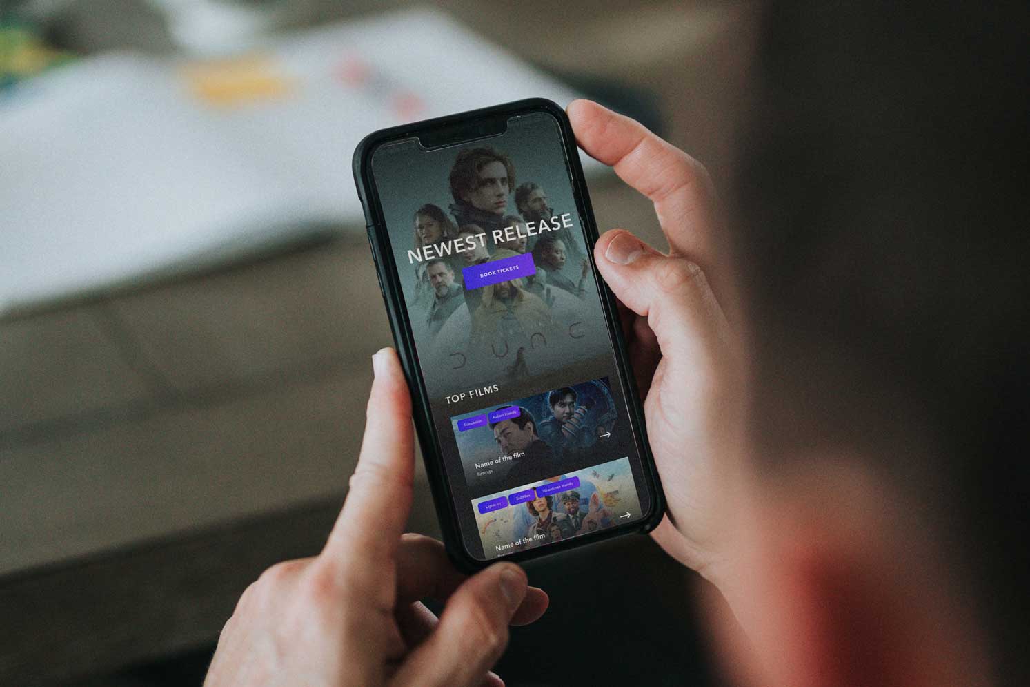
CineTicket is a ticketing app for cinemas marketed towards those with accessibility issues. CineTicket strives to make the booking of tickets and getting to the location the user needs as efficiently and stress free as possible without discrimination.
Project Duration:
August 2021 to September 2021
My Role & Responsibilities:
- Lead UX designer & UX researcher
- User research
- Wireframing
- Prototyping
- High Fidelity Mockups
The Problem:
To relieve the stress and anxiety for the needs of those with accessibility needs in their day to day live when experiencing the cinema.
The Goal:
The goal is to make booking tickets, visiting the cinema and locating your screen and seat as easy as possible with accessibility at the forefront.
User Research: Summary
I conducted interviews and created empathy maps to understand the users I’m designing for and their needs. A primary user group identified through research are people with invisible disabilities, in this case in particular those with Autism.This user group confirmed initial assumptions about Cinema Customers, but research also revealed that the onboarding process was not the one factor limiting users from managing their Cinema Ticket buying and management process. Other users problems included challenges that make it difficult to forward plan their in-person trip to the cinema for example clear and well defined filters around accessibility for cinemas and showings.
User Research: Paint Points
-
Pain point:
People with Neurodivergent conditions are unable to clearly find cinemas or shows that can accommodate their needs
-
Accessibility:
Platforms for ordering cinema tickets are not equipped with assistive technologies and under represent those with Nuerodivergent conditions.
-
Information Architecture
A lack of clear filtering options for Nuerodivergent cinema goers makes the experience very difficult.
User Journey Map
Mapping Davids user journey revealed how helpful it would be for users to be able to filter by category or by tutor to find relevant tutorials as quickly as possible.

Paper wireframes
Taking the time to draft iterations of each screen of the app on paper ensured that the elements that made it to digital wireframes would be well-suited to address user pain points. For the onboarding screen, I prioritized a quick and easy ordering questionnaire to help users enrich their experience.

Digital wireframes
As the initial design phase continued, I made sure to base screen designs on feedback and findings from the user research.
Identifying a persons accessibility requirements was a key user need to address in the designs in addition to equipping the app to work with assistive technologies.

Low-Fidelity Prototype
Using the completed set of digital wireframes, I created a low-fidelity prototype. The primary user flow I connected was onboarding for the user and their needs, so the prototype could be used in a usability study.
View the Low-Fidelity Prototype

Usability study: Findings
I conducted two rounds of usability studies. Findings from the first study helped guide the designs from wireframes to mockups. The second study used a high-fidelity prototype and revealed what aspects of the mockups needed refining.
Round 1 findings
- Users appreciate the onboarding process
- Users like that they can also skip onboarding
- Users appreciate the information being used to locate the nearest and most suitable cinema
Round 2 findings
- Users wanted identifying accessibility tags to be instantly viewable on the listings
- Users wanted accessibility tags higher up on the product page
Mockups
- Users wanted identifying accessibility tags to be instantly viewable on the listings
- Users wanted accessibility tags higher up on the product page
Please see before and after images below.

High-Fidelity Prototype
The final high-fidelity prototype presented cleaner user flows for onboarding, Booking and checkout. It also met user needs for matching users to appropriate listings.
View the High-Fidelity Prototype

Accessibility considerations
- Provided access to users who are vision impaired through adding alt text to images for screen readers.
- Used icons to help make navigation easier.
- Used detailed imagery for to help all users better understand the designs.
Going Forward - Takeaways
Impact:
The app makes users feel like CineTicket really thinks about how to meet their needs.
One quote from peer feedback:
“Because I have already chosen my cinema with my preferences via onboarding i dont have to worry or be anxious about accessibility issues when i arrive"
What I learned:
While designing the CineTicket app, I learned that the first ideas for the app are only the beginning of the process. Usability studies and peer feedback influenced each iteration of the app’s designs.
Next Steps
- Conduct another round of usability studies to validate whether the pain points users experienced have been effectively addressed.
- Conduct more user research to determine any new areas of need.
Thank you!
Thank you for your time reviewing my work on the Creative Supply! If you’d like to
see more or get in touch, my contact information is provided below.
Email: joshua@madebymclean.com
Website: madebymclean.com


